Controls Tab
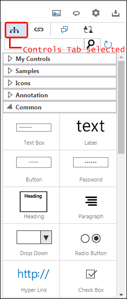
• Controls Tab is used to add controls in a mockup.
• This tab is only shown in the Smart Panel when the user is working on a mockup.
• Controls in the tab are arranged in five categories.
• Common: commonly used controls
• Icons: Icon shapes that can be used in mockups
• Annotation: used to add additional information about the mockup
• Samples: customized controls
• My Controls: user created controls
• Following controls are available in the tab:
|
Category |
Icon |
Name |
|
Common |
|
Textbox |
|
Common |
|
Label |
|
Common |
|
Button |
|
Common |
|
Password |
|
Common |
|
Heading |
|
Common |
|
Paragraph |
|
Common |
|
Dropdown |
|
Common |
|
RadioButton |
|
Common |
|
Hyperlink |
|
Common |
|
Checkbox |
|
Common |
|
RichTextEditor |
|
Common |
|
TextArea |
|
Common |
|
Container |
|
Common |
|
Picture |
|
Common |
|
Tab |
|
Common |
|
MenuBar |
|
Common |
|
Accordion |
|
Common |
|
ButtonToolBar |
|
Common |
|
Table |
|
Common |
|
Grid |
|
Common |
|
MultilevelList |
|
Common |
|
TreeView |
|
Common |
|
Slider |
|
Common |
|
ProgressBar |
|
Common |
|
DatePicker |
|
Common |
|
DateTimePicker |
|
Common |
|
Rating |
|
Common |
|
NumericStepper |
|
Common |
|
YouTube |
|
Common |
|
Carousel |
|
Annotation |
|
CircleAnnotation |
|
Annotation |
|
SquareAnnotation |
|
Annotation |
|
RoundRectAnnotation |
|
Annotation |
|
StickyNotes |
|
Annotation |
|
Callout |
|
Annotation |
|
Annotation |
|
Icons |
|
Home |
|
Icons |
|
At |
|
Icons |
|
Upward Arrow |
|
Icons |
|
Downward Arrow |
|
Icons |
|
Forward Arrow |
|
Icons |
|
Backward Arrow |
|
Icons |
|
Rounded Left Arrow |
|
Icons |
|
Rounded Right Arrow |
|
Icons |
|
Inactive Right |
|
Icons |
|
Active Right |
|
Icons |
|
Right Arrow |
|
Icons |
|
Enlarge Screen |
|
Icons |
|
YouTube Play |
|
Icons |
|
Media Play |
|
Icons |
|
Favourite |
|
Icons |
|
Invite |
|
Icons |
|
Dot Loading |
|
Icons |
|
Circle Loading |
|
Icons |
|
Time Loading |
|
Icons |
|
Box Loading |
|
Icons |
|
Messages |
|
Icons |
|
Notification |
|
Icons |
|
Refresh |
|
Icons |
|
Search |
|
Icons |
|
Separator |
|
Icons |
|
Settings |
|
Icons |
|
Toggle Off |
|
Icons |
|
Toggle On |
|
Icons |
|
Warning |
|
Icons |
|
Right Connector |
|
Icons |
|
Left Connector |
|
Samples |
|
Name |
|
Samples |
|
Address |
|
Samples |
|
|


