Smart Panel
• The Smart Panel for mockup comprises of different tabs like Controls, Links, Feedback Response.
• Various sections of the panel are described below
|
|
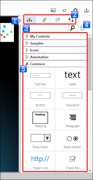
Panel Expand/Collapse Control |
Used to view/hide the Controls Panel |
|
|
Smart Panel Tabs |
|
|
|
Controls Search Box |
Used to search desired controls |
|
|
Refresh Controls Button |
Used to refresh the Controls List |
|
|
Controls List |
Shows the list of available controls. The controls are categorized as following:
Users can drag-and-drop the desired controls on the Modeling Area to design the desired layout of the mockup |


 The Controls Tab is selected by default. It shows the list of available controls.
 The Links Tab can be selected to show/create links of mockup entities with Work Item
 The Discussion Tab can be used to view/provide comments to the current mockup / use case
 The Feedback Response Tab can be used to view the feedback responses given by the stakeholders


Smart Panel Tabs
Currently The Smart Panel has four tabs:
1. Controls Tab shows the list of available controls.
2. Links Tab shows the list of Work Items linked with the mockup controls. Users can also create link with new or existing Work Items or delete an unwanted link.
3. Discussion Tab shows the comments given to the current mockup / use case
4. Feedback Response Tab shows the feedback responses given by the stakeholders (that were requested to provide feedback)
